
Advanced training course in data analysis for genomic surveillance of African malaria vectors
Detecting population structure using PCA#
Theme: Analysis
In this module, we’re going to investigate population structure by running principal components analysis (PCA) using genetic variation data from Ag3.0. We will use functions in the malariagen_data python package to run and plot PCAs, then learn how interpret the results to discover taxonomic and geographic structure in mosquito populations.
Learning objectives#
At the end of this module, you will be able to:
Compute principal component analyses across different mosquito cohorts.
Plot variance and principal components and interpret results.
Discover taxonomic and geographic population structure.
Recap: what is population structure?#
First, let’s remind ourselves of the concept of population structure we covered in Workshop 3 Module 4 of the beginner’s data analysis training course.
In Ag3.0, there are 2,784 wild-caught mosquitoes collected from 19 countries in sub-Saharan Africa. This includes mosquitoes from three known species within the Anopheles gambiae species complex. When we have a cohort of mosquitoes from different species and/or geographical locations, we would expect that not all mosquitoes are equally closely related to each other. These non-random patterns of relatedness are known as population structure.
For example, we might expect that any two mosquitoes from the same species will be more closely related than two mosquitoes from different species. This will, hopefully, be intuitively obvious, because mosquitoes will prefer to mate with individuals of the same species, even if they live alongside mosquitoes from other species and can hybridise. This is also known as reproductive isolation and it may be caused by different drivers, e.g., behavioural differences leading to a lower likelihood of mating.

Similarly, we might expect that two mosquitoes sampled from the same location will be more closely related than two mosquitoes sampled from distant locations. This is based on the assumption that mosquitoes may travel to find a mate, but may only be willing or able to travel a certain distance. Mosquitoes may also be impeded from travelling in certain directions by natural physical barriers, such as a region of elevated terrain, or by variation in the availability of suitable habitat. These limits and barriers to movement can thus generate population structure, also known as geographic isolation.

For both of these causes of population structure – reproductive isolation and geographical isolation – we may have some idea of what to expect based on our knowledge of previous studies, but we may be surprised.
For example, the Anopheles gambiae species complex continues to be unravelled, and there may be cryptic species that we were not previously aware of (e.g., see Crawford et al. 2016 and Tennessen et al. 2020). We covered this topic during Workshop 4
Also, recent studies have suggested that some malaria mosquitoes may engage in long-distance migration (Huestis et al. 2019), challenging the previous view that mosquitoes generally don’t travel more than a few kilometres in their lifetimes (Service 1997). But we still don’t know to what extent long-distance migration occurs, or whether the rate or range of migration varies between geographical regions and/or mosquito species. We would also like to learn more about how ecological and landscape variation affects the movement and interbreeding of mosquito populations in different regions of Africa.
In short, we would like to investigate population structure, and we can use genetic variation data to do that. There are various methods for analysing population structure, but this module will focus on just one of these methods, principal components analysis (PCA). PCA is attractive because it is model-free, meaning that you don’t need to specify any model of population structure before-hand, you can just run PCA and start exploring the results. On the other hand, interpreting PCA requires some care, which we’ll expand on a little below. If you’re interested in reading more deeply about using PCA for investigating population structure, Patterson et al. (2006), Novembre and Stephens (2008) and McVean (2009) are all great resources.
Recap: what is PCA?#
In Workshop 3 Module 4 of the beginner’s training course we’ve seen some examples of PCA being used to identify genetic structure in a group of samples and we’ve heard why being able to detect structure is useful for genomic surveillance and vector control, but what is a PCA actually doing to our data.
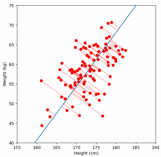
Fundamentally, PCA is a method for reducing the dimensions of a dataset to help make interpreting the data easier. A very simple example of what we mean by dimensions, one which we wouldn’t need PCA for, is a dataset in which each sample has two dimensions “weight” and “height”. With two dimensions we might be able to detect a relationship between them by looking at a scatter plot of the data, but what if a dataset had many more dimensions?
We are are interested in detecting population structure in a region of genomic data (e.g., a chomosome arm) which might have millions of SNPs (from hundreds or thousands of samples). Each consecutive genomic position in the dataset adds another dimension, so we can no longer easily compare the relationship of every dimension to every other dimension, like we could with our “weight” vs. “height” data example. Instead, we use PCA to project principal components, which are similar to lines-of-best-fit, through our multi-dimensional data.
PC1, the first principal component, is the axis which describes the most variance in our data. All samples receive a single value for PC1 which describes their position along this axis. PC2 is the axis which describes the next most variance, and so on. A dataset with 100,000 dimensions can generate 100,000 principal components, but as much of the variance is explained (reduced) to the first few PCs we only need these to look for relationships. In our case, these relationships are population structure.
For a deeper dive into how PCA works, Bill Connelly’s blog post is excellent.
Behind the scenes of the ag3.pca() function#
Here’s what’s happening behind the scenes when we run the ag3.pca() function:
Access the genotypes that we would like to run the analysis on from Google Cloud Storage - which
sample_sets, whichregionof the genome, and apply anysample_queryincluded in the parameters (we will look at this functionality a bit later).Allele count - this is the count of the alternate alleles for each site in the selected genomic region, across our samples. We are interested in sites where there is variation in our samples, known as segregating sites, particularly biallelic sites including the reference allele (i.e. where there is one alternate allele). These are the data upon which the PCA is run.
Thin the allele count - With
ag3.pca(), we can run a PCA analysis on entire chromosome arms, which contain millions of genomic positions. However, we can get strong signals of structure by using just a subset of our segregating sites. Additionally, if we used all the sites available, it would make our analysis very slow. Then_snpsparameter is used to ‘thin’ our SNPs. We find that around 100,000 SNPs is more than enough for analysis of population structure.Run the PCA!
Setup#
Now that we have covered some of the theoretical background for population structure analyses using PCA, let’s install and import the python packages we will need for our analyses.
!pip install malariagen_data
Note that authentication is required to access data through the package, please follow the instructions here.
import malariagen_data
import os
import plotly.express as px
import plotly.io as pio
pio.renderers.default = "notebook+colab"
Saving PCA results#
Some PCA runs may take a while to complete, particularly if you’re running this code on a service with modest computational resources such as Google Colab, because genotype calls from tens of millions of SNPs may need to be scanned to identify and extract the data for PCA. The run time will depend on the number of samples included in the analysis, but may take 20 mins or more for larger analyses.
To avoid having to rerun these analyses, we’ll save the results so we can come back to them later. In Google Colab, you can save results to your Google Drive, which will mean you don’t lose results even if you leave the notebook and come back several days later.
When mounting your Google Drive, you will need to follow the authorization instructions.
try:
    from google.colab import drive
    drive.mount("drive")
except ImportError:
    # For course maintainers, turn off progress logging.
    os.environ["MGEN_SHOW_PROGRESS"] = "0"
    pass
With our Google Drive now mounted, we can define and make a directory where we want to save our PCA results.
results_dir = "drive/MyDrive/Colab Data/ag3-pca-results"
os.makedirs(results_dir, exist_ok=True)
In Google Colab, we can actually see our mounted drive and PCA results directory by clicking on the file tab on the left hand side of the screen.
Next we should setup the malariagen_data package. As we want to save our PCA results in the Google Drive folder we just set up, we’ll use the results_cache parameter and assign our results directory to it. If we were running this notebook locally, then we could assign a local folder to this parameter and the PCA results would instead get stored on our hard drive.
ag3 = malariagen_data.Ag3(results_cache=results_dir)
ag3
| MalariaGEN Ag3 API client | |
|---|---|
| Please note that data are subject to terms of use, for more information see the MalariaGEN website or contact support@malariagen.net. See also the Ag3 API docs. | |
| Storage URL | gs://vo_agam_release_master_us_central1 |
| Data releases available | 3.0, 3.1, 3.2, 3.3, 3.4, 3.5, 3.6, 3.7, 3.8, 3.9, 3.10, 3.11, 3.12, 3.13, 3.14 |
| Results cache | /home/jonbrenas/anopheles-genomic-surveillance.github.io/docs/advanced-training-materials/drive/MyDrive/Colab Data/ag3-pca-results |
| Cohorts analysis | 20250502 |
| AIM analysis | 20220528 |
| Site filters analysis | dt_20200416 |
| Software version | malariagen_data 15.2.0 |
| Client location | Iowa, United States (Google Cloud us-central1) |
The output of ag3 shows us the “Client location”. This is where our Google Colab virtual machine is running on the cloud. As the data we would like to analyse is located in the US, it is worth checking that our notebook is running there too. If not, click “Runtime > Disconnect and delete runtime” from the menu, then re-run the notebook and check again.
Analysis: Central African Republic#
Now we’ve set up our environment and we understand a bit more about PCA, we should run an analysis.
As discussed earlier, there a multiple steps involved in running a PCA analysis, but for convenience, we have combined these into a malariagen_data function called ag3.pca(). Before we start, let’s have a quick look at the documention using “?”
ag3.pca?
Signature:
ag3.pca(
    region: Union[str, malariagen_data.util.Region, Mapping, List[Union[str, malariagen_data.util.Region, Mapping]], Tuple[Union[str, malariagen_data.util.Region, Mapping], ...]],
    n_snps: int,
    n_components: int = 20,
    thin_offset: int = 0,
    sample_sets: Union[str, Sequence[str], NoneType] = None,
    sample_query: Optional[str] = None,
    sample_query_options: Optional[dict] = None,
    sample_indices: Optional[List[int]] = None,
    site_mask: Optional[str] = 'default',
    site_class: Optional[str] = None,
    min_minor_ac: Union[int, float, NoneType] = 2,
    max_missing_an: Union[int, float, NoneType] = 0,
    cohort_size: Optional[int] = None,
    min_cohort_size: Optional[int] = None,
    max_cohort_size: Optional[int] = None,
    exclude_samples: Union[str, int, List[Union[str, int]], Tuple[Union[str, int], ...], NoneType] = None,
    fit_exclude_samples: Union[str, int, List[Union[str, int]], Tuple[Union[str, int], ...], NoneType] = None,
    random_seed: int = 42,
    inline_array: bool = True,
    chunks: Union[int, str, Tuple[Union[int, str], ...], Callable[[Tuple[int, ...]], Union[int, str, Tuple[Union[int, str], ...]]]] = 'native',
) -> Tuple[pandas.core.frame.DataFrame, numpy.ndarray]
Docstring:
Run a principal components analysis (PCA) using biallelic SNPs from the
selected genome region and samples.

.. versionchanged:: 8.0.0    SNP ascertainment has changed slightly.
This function uses biallelic SNPs as input to the PCA. The ascertainment
of SNPs to include has changed slightly in version 8.0.0 and therefore
the results of this function may also be slightly different. Previously,
SNPs were required to be biallelic and one of the observed alleles was
required to be the reference allele. Now SNPs just have to be biallelic.
The following additional parameters were also added in version 8.0.0:
`site_class`, `cohort_size`, `min_cohort_size`, `max_cohort_size`,
`random_seed`.

Parameters
----------
region : str or Region or Mapping or list of str or Region or Mapping or tuple of str or Region or Mapping
    Region of the reference genome. Can be a contig name, region string
    (formatted like "{contig}:{start}-{end}"), or identifier of a genome
    feature such as a gene or transcript. Can also be a sequence (e.g.,
    list) of regions.
n_snps : int
    The desired number of SNPs to use when running the analysis. SNPs will
    be evenly thinned to approximately this number.
n_components : int, optional, default: 20
    Number of components to return.
thin_offset : int, optional, default: 0
    Starting index for SNP thinning. Change this to repeat the analysis
    using a different set of SNPs.
sample_sets : sequence of str or str or None, optional
    List of sample sets and/or releases. Can also be a single sample set
    or release.
sample_query : str or None, optional
    A pandas query string to be evaluated against the sample metadata, to
    select samples to be included in the returned data.
sample_query_options : dict or None, optional
    A dictionary of arguments that will be passed through to pandas
    query() or eval(), e.g. parser, engine, local_dict, global_dict,
    resolvers.
sample_indices : list of int or None, optional
    Advanced usage parameter. A list of indices of samples to select,
    corresponding to the order in which the samples are found within the
    sample metadata. Either provide this parameter or sample_query, not
    both.
site_mask : str or None, optional, default: 'default'
    Which site filters mask to apply. See the `site_mask_ids` property for
    available values.
site_class : str or None, optional
    Select sites belonging to one of the following classes: CDS_DEG_4,
    (4-fold degenerate coding sites), CDS_DEG_2_SIMPLE (2-fold simple
    degenerate coding sites), CDS_DEG_0 (non-degenerate coding sites),
    INTRON_SHORT (introns shorter than 100 bp), INTRON_LONG (introns
    longer than 200 bp), INTRON_SPLICE_5PRIME (intron within 2 bp of 5'
    splice site), INTRON_SPLICE_3PRIME (intron within 2 bp of 3' splice
    site), UTR_5PRIME (5' untranslated region), UTR_3PRIME (3'
    untranslated region), INTERGENIC (intergenic, more than 10 kbp from a
    gene).
min_minor_ac : int or float or None, optional, default: 2
    The minimum minor allele count. SNPs with a minor allele count below
    this value will be excluded. Can also be a float, which will be
    interpreted as a fraction.
max_missing_an : int or float or None, optional, default: 0
    The maximum number of missing allele calls to accept. SNPs with more
    than this value will be excluded. Set to 0 to require no missing
    calls. Can also be a float, which will be interpreted as a fraction.
cohort_size : int or None, optional
    Randomly down-sample to this value if the number of samples in the
    cohort is greater. Raise an error if the number of samples is less
    than this value.
min_cohort_size : int or None, optional
    Minimum cohort size. Raise an error if the number of samples is less
    than this value.
max_cohort_size : int or None, optional
    Randomly down-sample to this value if the number of samples in the
    cohort is greater.
exclude_samples : str or int or list of str or int or tuple of str or int or None, optional
    Sample identifier or index within sample set. Multiple values can also
    be provided as a list or tuple.
fit_exclude_samples : str or int or list of str or int or tuple of str or int or None, optional
    Sample identifier or index within sample set. Multiple values can also
    be provided as a list or tuple.
random_seed : int, optional, default: 42
    Random seed used for reproducible down-sampling.
inline_array : bool, optional, default: True
    Passed through to dask `from_array()`.
chunks : int or str or tuple of int or str or Callable[[typing.Tuple[int, ...]], int or str or tuple of int or str], optional, default: 'native'
    Define how input data being read from zarr should be divided into
    chunks for a dask computation. If 'native', use underlying zarr
    chunks. If a string specifying a target memory size, e.g., '300 MiB',
    resize chunks in arrays with more than one dimension to match this
    size. If 'auto', let dask decide chunk size.  If 'ndauto', let dask
    decide chunk size but only for arrays with more than one dimension. If
    'ndauto0', as 'ndauto' but only vary the first chunk dimension. If
    'ndauto1', as 'ndauto' but only vary the second chunk dimension. If
    'ndauto01', as 'ndauto' but only vary the first and second chunk
    dimensions. Also, can be a tuple of integers, or a callable which
    accepts the native chunks as a single argument and returns a valid
    dask chunks value.

Returns
-------
df_pca : DataFrame
    A dataframe of projections along principal components, one row per
    sample. The columns are:     `sample_id` is the identifier of the
    sample,     `partner_sample_id` is the identifier of the sample used
    by the partners who contributed it,     `contributor` is the partner
    who contributed the sample,     `country` is the country the sample
    was collected in,     `location` is the location the sample was
    collected in,     `year` is the year the sample was collected,
    `month` is the month the sample was collected,     `latitude` is the
    latitude of the location the sample was collected in,
    `longitude` is the longitude of the location the sample was
    collected in,     `sex_call` is the sex of the sample,
    `sample_set` is the sample set containing the sample,     `release`
    is the release containing the sample,     `quarter` is the quarter
    of the year the sample was collected,     `study_id* is the
    identifier of the study the sample set containing the sample came
    from,     `study_url` is the URL of the study the sample set
    containing the sample came from,     `terms_of_use_expiry_date` is
    the date the terms of use for the sample expire,
    `terms_of_use_url` is the URL of the terms of use for the sample,
    `unrestricted_use` indicates whether the sample can be used without
    restrictions (e.g., if the terms of use of expired),     `mean_cov`
    is mean value of the coverage,     `median_cov` is the median value
    of the coverage,     `modal_cov` is the mode of the coverage,
    `mean_cov_2L` is mean value of the coverage on 2L,
    `median_cov_2L` is the median value of the coverage on 2L,
    `mode_cov_2L` is the mode of the coverage on 2L,     `mean_cov_2R`
    is mean value of the coverage on 2R,     `median_cov_2R` is the
    median value of the coverage on 2R,     `mode_cov_2R` is the mode of
    the coverage on 2R,     `mean_cov_3L` is mean value of the coverage
    on 3L,     `median_cov_3L` is the median value of the coverage on
    3L,     `mode_cov_3L` is the mode of the coverage on 3L,
    `mean_cov_3R` is mean value of the coverage on 3R,
    `median_cov_3R` is the median value of the coverage on 3R,
    `mode_cov_3R` is the mode of the coverage on 3R,     `mean_cov_X` is
    mean value of the coverage on X,     `median_cov_X` is the median
    value of the coverage on X,     `mode_cov_X` is the mode of the
    coverage on X,     `frac_gen_cov` is the faction of the genome
    covered,     `divergence` is the divergence,     `contam_pct` is the
    percentage of contamination,     `contam_LLR` is the log-likelihood
    ratio of contamination,     `aim_species_fraction_arab` is the
    fraction of the gambcolu vs. arabiensis AIMs that indicated
    arabiensis (this column is only present for *Ag3*),
    `aim_species_fraction_colu` is the fraction of the gambiae vs.
    coluzzii AIMs that indicated coluzzii (this column is only present
    for *Ag3*),     `aim_species_fraction_colu_no2l` is the fraction of
    the gambiae vs. coluzzii AIMs that indicated coluzzii, not including
    the chromosome arm 2L which contains an introgression (this column
    is only present for *Ag3*),     `aim_species_gambcolu_arabiensis` is
    the taxonomic group assigned by the gambcolu vs. arabiensis AIMs
    (this column is only present for *Ag3*),
    `aim_species_gambiae_coluzzi` is the taxonomic group assigned by the
    gambiae vs. coluzzii AIMs (this column is only present for *Ag3*),
    `aim_species_gambcolu_arabiensis` is the taxonomic group assigned by
    the combination of both AIMs analyses (this column is only present
    for *Ag3*),     `country_iso` is the ISO code of the country the
    sample was collected in,     `admin1_name` is the name of the first
    administrative level the sample was collected in,     `admin1_iso`
    is the ISO code of the first administrative level the sample was
    collected in,     `admin2_name` is the name of the second
    administrative level the sample was collected in,     `taxon` is the
    taxon assigned to the sample by the combination of the AIMs analysis
    and the cohort analysis,     `cohort_admin1_year` is the cohort the
    sample belongs to when samples are grouped by first administrative
    level and year,     `cohort_admin1_month` is the cohort the sample
    belongs to when samples are grouped by first administrative level
    and month,     `cohort_admin1_quarter` is the cohort the sample
    belongs to when samples are grouped by first administrative level
    and quarter,     `cohort_admin2_year` is the cohort the sample
    belongs to when samples are grouped by second administrative level
    and year,     `cohort_admin2_month` is the cohort the sample belongs
    to when samples are grouped by second administrative level and
    month,     `cohort_admin2_quarter` is the cohort the sample belong
    to when samples are grouped by second administrative level and
    quarter.     `PC?` is the projection along principal component ? (?
    being an integer between 1 and the number of components). There are
    as many such columns as components,     `pca_fit` is whether this
    sample was used for fitting.
evr : ndarray
    An array of explained variance ratios, one per component.

Notes
-----
This computation may take some time to run, depending on your
computing environment. Results of this computation will be cached and
re-used if the `results_cache` parameter was set when instantiating
the API client.
File:      /home/conda/developer/35674e27b19f7c625ba32a1b88449ff45c90b40edb90a065b66c5a9a5388f41c-20250421-195247-360829-93-training-nb-maintenance-mgen-15.2.0/lib/python3.11/site-packages/malariagen_data/anoph/pca.py
Type:      method
We can see that there are two required parameters:
regionis one we are probably getting familar with by now, it defines what region of the genome we want to run the analyses over. We could assign a whole chromosome arm, a chromosome region (with a start and stop point), or a specific gene of interest.n_snpsrequires us to define how many SNPs we would like to thin our region down to, as PCA doesn’t require every SNP (plus without thinning it could potentially take a very long time to run the analysis).
Today, we are going to run the PCA on a section of the 3L chromosome arm. 3L is a good choice of chromosome arm when looking at population structure, as results are not confounded by the large inversions that are found on 2L, 2R, 3R and X.
We’ll thin the SNPs on 3L down to around 100,000 as that should be plenty to see signals of structure, and rather than looking at all the Ag3.0 data, let’s use the sample_sets parameter to just look at the Central African Republic.
region = "3L:15,000,000-41,000,000"
n_snps = 100_000
sample_sets = "AG1000G-CF"
The ag3.pca() function actually returns two values, so we need to assign two variables when we run it.
pca_df, evr = ag3.pca(region=region, n_snps=n_snps, sample_sets=sample_sets)
Plotting principal components#
Let’s have a look at the pca_df output. It’s a Pandas DataFrame with one row per sample.
pca_df.head()
| sample_id | partner_sample_id | contributor | country | location | year | month | latitude | longitude | sex_call | ... | PC12 | PC13 | PC14 | PC15 | PC16 | PC17 | PC18 | PC19 | PC20 | pca_fit | |
|---|---|---|---|---|---|---|---|---|---|---|---|---|---|---|---|---|---|---|---|---|---|
| 0 | BK0001-C | RCA_1 | Alessandra della Torre | Central African Republic | Bangui | 1993 | 12 | 4.367 | 18.583 | F | ... | -3.424033 | -47.487534 | -4.120463 | 39.790260 | -46.477631 | 110.737038 | -6.065052 | 29.933401 | 10.687611 | True |
| 1 | BK0002-C | RCA_2 | Alessandra della Torre | Central African Republic | Bangui | 1993 | 12 | 4.367 | 18.583 | F | ... | -3.993272 | -26.814077 | 11.277775 | 16.596825 | 4.819422 | 15.997876 | 36.661594 | -38.647438 | -67.028801 | True |
| 2 | BK0003-C | RCA_3 | Alessandra della Torre | Central African Republic | Bangui | 1993 | 12 | 4.367 | 18.583 | F | ... | 14.785239 | -11.075434 | 22.276703 | -1.681086 | 5.268364 | 19.272924 | 24.206596 | -8.081183 | -39.076553 | True |
| 3 | BK0005-C | RCA_5 | Alessandra della Torre | Central African Republic | Bangui | 1993 | 12 | 4.367 | 18.583 | F | ... | -6.697465 | -41.748524 | -38.901199 | -16.787464 | -48.072922 | -26.319130 | 63.813713 | 10.196549 | 46.525330 | True |
| 4 | BK0006-C | RCA_6 | Alessandra della Torre | Central African Republic | Bangui | 1993 | 12 | 4.367 | 18.583 | F | ... | 8.766584 | -7.004684 | -3.395151 | -1.999511 | 10.481687 | 4.968693 | -45.888390 | -14.405526 | 24.060898 | True |
5 rows × 78 columns
There are 78 columns, so we can’t fit them all our screen. If we access the column headers we can see that the first 57 columns are all metadata relating to the mosquito sample, e.g. its sample ID, collection site, taxon, etc.
pca_df.columns
Index(['sample_id', 'partner_sample_id', 'contributor', 'country', 'location',
       'year', 'month', 'latitude', 'longitude', 'sex_call', 'sample_set',
       'release', 'quarter', 'study_id', 'study_url',
       'terms_of_use_expiry_date', 'terms_of_use_url', 'unrestricted_use',
       'mean_cov', 'median_cov', 'modal_cov', 'mean_cov_2L', 'median_cov_2L',
       'mode_cov_2L', 'mean_cov_2R', 'median_cov_2R', 'mode_cov_2R',
       'mean_cov_3L', 'median_cov_3L', 'mode_cov_3L', 'mean_cov_3R',
       'median_cov_3R', 'mode_cov_3R', 'mean_cov_X', 'median_cov_X',
       'mode_cov_X', 'frac_gen_cov', 'divergence', 'contam_pct', 'contam_LLR',
       'aim_species_fraction_arab', 'aim_species_fraction_colu',
       'aim_species_fraction_colu_no2l', 'aim_species_gambcolu_arabiensis',
       'aim_species_gambiae_coluzzii', 'aim_species', 'country_iso',
       'admin1_name', 'admin1_iso', 'admin2_name', 'taxon',
       'cohort_admin1_year', 'cohort_admin1_month', 'cohort_admin1_quarter',
       'cohort_admin2_year', 'cohort_admin2_month', 'cohort_admin2_quarter',
       'PC1', 'PC2', 'PC3', 'PC4', 'PC5', 'PC6', 'PC7', 'PC8', 'PC9', 'PC10',
       'PC11', 'PC12', 'PC13', 'PC14', 'PC15', 'PC16', 'PC17', 'PC18', 'PC19',
       'PC20', 'pca_fit'],
      dtype='object')
If we use the .groupby function we can see that all samples were collected from a single location over two consecutive years.
pca_df.groupby(["country", "location", "year"]).size()
country                   location  year
Central African Republic  Bangui    1993     7
                                    1994    66
dtype: int64
The next 20 columns, all beginning “PC…”, are the results of our PCA analysis. For each sample we have generated a value for each of 20 principal components. We could return results for more or less principal components using the n_components parameter in ag3.pca(), but 20 is a good starting point.
We can examine these principal components and look for population structure in our dataset, by plotting one against another. As we know, the components are ordered by how much variance in the data they explain, so let’s look at PC1 and PC2 first.
We can use plotly express to make a simple scatter plot of these principal components.
fig = px.scatter(pca_df, x="PC1", y="PC2")
fig.show()
Each point here is a sample, so we can see that PC1 pulls apart two large clusters of samples and PC2 separates out two samples. Though this plot is informative, we could add some more data to make it easier to interpret. For example, if we coloured the points by taxon, we could spot if any clustering is being potentially driven by reproductive isolation between species.
We could add more parameters to our plotly express argument above to achieve this, but to streamline our analysis process, we have added a function within malariagen_data called ag3.plot_pca_coords() that will do this for us.
ag3.plot_pca_coords?
Signature:
ag3.plot_pca_coords(
    data: pandas.core.frame.DataFrame,
    x: str = 'PC1',
    y: str = 'PC2',
    color: Union[str, Mapping, NoneType] = None,
    symbol: Union[str, Mapping, NoneType] = None,
    opacity: float = 0.9,
    jitter_frac: Optional[float] = 0.02,
    random_seed: int = 42,
    width: Optional[int] = 900,
    height: Optional[int] = 600,
    marker_size: Union[int, float] = 10,
    color_discrete_sequence: Optional[List] = None,
    color_discrete_map: Optional[Mapping] = None,
    category_orders: Union[List, Mapping, NoneType] = None,
    legend_sizing: Literal['constant', 'trace'] = 'constant',
    show: bool = True,
    renderer: Optional[str] = None,
    render_mode: Literal['auto', 'svg', 'webgl'] = 'svg',
    **kwargs,
) -> Optional[plotly.graph_objs._figure.Figure]
Docstring:
Plot sample coordinates from a principal components analysis (PCA) as a
plotly scatter plot.

Parameters
----------
data : DataFrame
    A dataframe of projections along principal components, one row per
    sample. The columns are:     `sample_id` is the identifier of the
    sample,     `partner_sample_id` is the identifier of the sample used
    by the partners who contributed it,     `contributor` is the partner
    who contributed the sample,     `country` is the country the sample
    was collected in,     `location` is the location the sample was
    collected in,     `year` is the year the sample was collected,
    `month` is the month the sample was collected,     `latitude` is the
    latitude of the location the sample was collected in,     `longitude`
    is the longitude of the location the sample was collected in,
    `sex_call` is the sex of the sample,     `sample_set` is the sample
    set containing the sample,     `release` is the release containing the
    sample,     `quarter` is the quarter of the year the sample was
    collected,     `study_id* is the identifier of the study the sample
    set containing the sample came from,     `study_url` is the URL of the
    study the sample set containing the sample came from,
    `terms_of_use_expiry_date` is the date the terms of use for the sample
    expire,     `terms_of_use_url` is the URL of the terms of use for the
    sample,     `unrestricted_use` indicates whether the sample can be
    used without restrictions (e.g., if the terms of use of expired),
    `mean_cov` is mean value of the coverage,     `median_cov` is the
    median value of the coverage,     `modal_cov` is the mode of the
    coverage,     `mean_cov_2L` is mean value of the coverage on 2L,
    `median_cov_2L` is the median value of the coverage on 2L,
    `mode_cov_2L` is the mode of the coverage on 2L,     `mean_cov_2R` is
    mean value of the coverage on 2R,     `median_cov_2R` is the median
    value of the coverage on 2R,     `mode_cov_2R` is the mode of the
    coverage on 2R,     `mean_cov_3L` is mean value of the coverage on 3L,
    `median_cov_3L` is the median value of the coverage on 3L,
    `mode_cov_3L` is the mode of the coverage on 3L,     `mean_cov_3R` is
    mean value of the coverage on 3R,     `median_cov_3R` is the median
    value of the coverage on 3R,     `mode_cov_3R` is the mode of the
    coverage on 3R,     `mean_cov_X` is mean value of the coverage on X,
    `median_cov_X` is the median value of the coverage on X,
    `mode_cov_X` is the mode of the coverage on X,     `frac_gen_cov` is
    the faction of the genome covered,     `divergence` is the divergence,
    `contam_pct` is the percentage of contamination,     `contam_LLR` is
    the log-likelihood ratio of contamination,
    `aim_species_fraction_arab` is the fraction of the gambcolu vs.
    arabiensis AIMs that indicated arabiensis (this column is only present
    for *Ag3*),     `aim_species_fraction_colu` is the fraction of the
    gambiae vs. coluzzii AIMs that indicated coluzzii (this column is only
    present for *Ag3*),     `aim_species_fraction_colu_no2l` is the
    fraction of the gambiae vs. coluzzii AIMs that indicated coluzzii, not
    including the chromosome arm 2L which contains an introgression (this
    column is only present for *Ag3*),
    `aim_species_gambcolu_arabiensis` is the taxonomic group assigned by
    the gambcolu vs. arabiensis AIMs (this column is only present for
    *Ag3*),     `aim_species_gambiae_coluzzi` is the taxonomic group
    assigned by the gambiae vs. coluzzii AIMs (this column is only present
    for *Ag3*),     `aim_species_gambcolu_arabiensis` is the taxonomic
    group assigned by the combination of both AIMs analyses (this column
    is only present for *Ag3*),     `country_iso` is the ISO code of the
    country the sample was collected in,     `admin1_name` is the name of
    the first administrative level the sample was collected in,
    `admin1_iso` is the ISO code of the first administrative level the
    sample was collected in,     `admin2_name` is the name of the second
    administrative level the sample was collected in,     `taxon` is the
    taxon assigned to the sample by the combination of the AIMs analysis
    and the cohort analysis,     `cohort_admin1_year` is the cohort the
    sample belongs to when samples are grouped by first administrative
    level and year,     `cohort_admin1_month` is the cohort the sample
    belongs to when samples are grouped by first administrative level and
    month,     `cohort_admin1_quarter` is the cohort the sample belongs to
    when samples are grouped by first administrative level and quarter,
    `cohort_admin2_year` is the cohort the sample belongs to when samples
    are grouped by second administrative level and year,
    `cohort_admin2_month` is the cohort the sample belongs to when samples
    are grouped by second administrative level and month,
    `cohort_admin2_quarter` is the cohort the sample belong to when
    samples are grouped by second administrative level and quarter.
    `PC?` is the projection along principal component ? (? being an
    integer between 1 and the number of components). There are as many
    such columns as components,     `pca_fit` is whether this sample was
    used for fitting.
x : str, optional, default: 'PC1'
    Name of variable to plot on the X axis.
y : str, optional, default: 'PC2'
    Name of variable to plot on the Y axis.
color : str or Mapping or None, optional
    Name of variable to use to color the markers.
symbol : str or Mapping or None, optional
    Name of the variable to use to choose marker symbols.
opacity : float, optional, default: 0.9
    Marker opacity.
jitter_frac : float or None, optional, default: 0.02
    Randomly jitter points by this fraction of their range.
random_seed : int, optional, default: 42
    Random seed used for reproducible down-sampling.
width : int or None, optional, default: 900
    Figure width in pixels (px).
height : int or None, optional, default: 600
    Figure height in pixels (px).
marker_size : int or float, optional, default: 10
    Marker size.
color_discrete_sequence : List or None, optional
    Provide a list of colours to use.
color_discrete_map : Mapping or None, optional
    Provide an explicit mapping from values to colours.
category_orders : List or Mapping or None, optional
    Control the order in which values appear in the legend.
legend_sizing : {'constant', 'trace'}, optional, default: 'constant'
    Determines if the legend items symbols scale with their corresponding
    "trace" attributes or remain "constant" independent of the symbol size
    on the graph.
show : bool, optional, default: True
    If true, show the plot. If False, do not show the plot, but return the
    figure.
renderer : str or None, optional
    The name of the renderer to use.
render_mode : {'auto', 'svg', 'webgl'}, optional, default: 'svg'
    The type of rendering backend to use. See also
    https://plotly.com/python/webgl-vs-svg/.
**kwargs
    Passed through to `px.scatter()`.

Returns
-------
Figure or None
    A plotly figure (only returned if show=False).
File:      /home/conda/developer/35674e27b19f7c625ba32a1b88449ff45c90b40edb90a065b66c5a9a5388f41c-20250421-195247-360829-93-training-nb-maintenance-mgen-15.2.0/lib/python3.11/site-packages/malariagen_data/anoph/pca.py
Type:      method
The documentation shows us that the only required parameter is our PCA output data. We’re going to also use the optional parameter color to pick the taxon column to define each point’s colour.
ag3.plot_pca_coords(
    pca_df,
    color="taxon",
)
By colouring the points according to their taxon, we can now see that PC1 is pulling apart samples according to whether they are Anopheles gambiae or coluzzii, which is what we might expect of samples collected in the same place at a similar time but that are reproductively isolated as they are different species.
These plotly plots are interactive, if we hover over a sample’s point we can see a lot of useful metadata (compare this to the simple plotly express plot we made earlier).
Plotting explained variance#
Let’s now have a look at the evr output. We can see that this is an array of 20 floats (numbers with decimal points). These are the percentage of variance in the dataset explained by each of our 20 principal components.
evr
array([0.02543753, 0.01907508, 0.01519341, 0.01494666, 0.01483775,
       0.01481333, 0.0146188 , 0.01456869, 0.01444939, 0.01440972,
       0.01435444, 0.01432144, 0.01428905, 0.01425463, 0.01423784,
       0.01416508, 0.01414097, 0.0141029 , 0.01407104, 0.0140475 ],
      dtype=float32)
If we look at our scatter plot of the 3L chromosome arm, it is clear that some of the An. gambiae samples spread out along PC2. How do we know whether this is meaningful or just random noise? Should we also investigate the higher principal components e.g. PC3 vs. PC4? One way to get an intuition for this is to examine the variance explained by each of the components.
The easiest was to do this is to plot our evr array in the form of a bar chart. We have a handy function in malariagen_data to do this for us. Again, this is an interactive plot and hovering the pointer over a bar will reveal the exact explained variance percentage.
ag3.plot_pca_variance(evr)
The first principal component explains around 2.5% of the variance, whereas all of the subsequent principal components explain around 1.5% of the variance. The absolute magnitude of these values is less important as this will change depending of what dataset we analyse. What is more important, however, is the fact that PC1 relatively explains much more variance than all the subsequent PCs. In other words, there is a big step down from PC1 to PC2, then the variance explained flattens off. This is a good indication that PC1 is capturing some real structure in the data, and the rest of the PCs are probably random noise.
There are various statistical methods for formally testing whether a principal component conveys a real signal of population structure or is just random noise (for example see Patterson et al. 2006 and Forkman et al. 2019). However, for exploratory analyses, looking at the differences in variance explained between the adjacent PCs, and ignoring the tail of PCs where the variance flattens off, is not a bad rule of thumb.
Interpretation: PCA and genetic distance#
In our scatter plot of PC1 and PC2, the An. coluzzii individuals all cluster close together. Similarly, most of the An. gambiae individuals cluster close together. It can be tempting to interpret this in the following way, which would be wrong:
“The individuals within each cluster are genetically nearly identical to each other.”
Similarly, it can be tempting to draw the following conclusion, which would also be wrong:
“The two clusters of individuals are genetically very different from each other.”
What is wrong with these statements?
In short, PCA does not tell you anything about the absolute magnitude of genetic distance between individuals. All it can tell you is something about relative genetic distance. The PCA tells us that the An. coluzzii individuals are more closely related to each other than to the An. gambiae individuals, and vice versa. However, it does not tell us how much more, and there may still be a lot of genetic diversity within each of these clusters.
The key point is that all individuals within each cluster are related (or unrelated) to each other by a similar degree.
We can see this in action if we compare these two PCA plots. The first is analysis of just the An. gambiae samples from Burkina Faso. The second is both the An. gambiae and An. coluzzii samples from the same country.
pca_bfg_df, evr_bfg = ag3.pca(
    region=region,
    n_snps=n_snps,
    sample_sets=["AG1000G-BF-A", "AG1000G-BF-B", "AG1000G-BF-C"],
    sample_query="taxon == 'gambiae' and country == 'Burkina Faso'",
)

ag3.plot_pca_coords(
    pca_bfg_df,
    color="taxon",
    title="Burkina Faso just An. gambiae"
)
pca_bf_df, evr_bfg = ag3.pca(
    region=region,
    n_snps=n_snps,
    sample_sets=["AG1000G-BF-A", "AG1000G-BF-B", "AG1000G-BF-C"],
    sample_query="taxon in ['gambiae', 'coluzzii'] and country == 'Burkina Faso'",
)

ag3.plot_pca_coords(
    pca_bf_df,
    color="taxon",
    title="Burkina Faso, An. gambiae and coluzzii"
)
As we can see from these two plots, the distance between the points is relative. In the first plot, An. gambiae samples are spread across PC2 and and a single sample, AB0325-C, is driving clustering on PC1. However, in the second plot the same samples are much more tightly clustered with PC1 now being driven by taxon and the gambiae outlier sample, AB0325-C, is now driving PC2.
Analysis: East African An. arabiensis#
We can also combine data from multiple countries to perform a broader analysis of population structure. Let’s run a PCA of some An. arabiensis mosquitoes from East Africa. This is a larger set of samples, so may take a little longer to run.
We’ll use the sample_query parameter to just analyse An. arabiensis from Tanzania, Kenya and Malawi.
pca_ea_df, evr_ea = ag3.pca(
    region="3L",
    n_snps=n_snps,
    sample_sets="3.0",
    sample_query="taxon == 'arabiensis' and country in ['Tanzania', 'Kenya', 'Malawi']",
)
ag3.plot_pca_coords(
    pca_ea_df,
    color="country",
)
By colouring the points according to country, we can see that PC1 is separating samples from Malawi away from the samples from Tanzania and Kenya. What we are looking at here is most likely geographical isolation between Malawi and the more northerly countries: Tanzania and Kenya.
There are a couple of Tanzanian samples that are separated along PC2. However, by plotting the variance explained by each principal component we can see that after PC1 the tail flattens off straight away, so the PC2 result is probably just noise.
ag3.plot_pca_variance(evr_ea)
Outlier removal#
When plotting a PCA, we may observe data points that are unusual because they deviate substantially from the majority of observations. Because they are very different from the rest of the data, such data points contribute an inflated degree of variance to the PC components and can be considered outliers in our analysis. Outliers contribute noise to the data and can therefore obscure interesting patterns of population structure. Often removing these outliers is important so that the variance and therefore, the calculated Principal Components, are a true representation of the data. Let’s run a PCA to investigate population structure in An. gambiae from East Africa. Specifically, we will focus the analysis on samples from Uganda and Tanzania.
pca_df, evr_df = ag3.pca(
    region=region,
    n_snps=n_snps,
    sample_sets=['1178-VO-UG-LAWNICZAK-VMF00025',
                '1246-VO-TZ-KABULA-VMF00197'],
    sample_query="taxon == 'gambiae'",
)
ag3.plot_pca_coords(
    pca_df,
    color="country",
)
Based on the result of this PCA, most of the samples from Tanzania appear to cluster with those from Uganda, suggesting there is unrestricted gene flow between the two countries. However, there are also quite a few individuals from Tanzania which are separate from the main cluster, widely dispersed across the PCA plot. Hovering over these individuals we can see they are from Muleba but there are also individuals from the same geographical location of Muleba within the main cluster containing other locations in Tanzania as well as Uganda. Therefore, these dispersed data points do not appear to represent a particular geographical area. These could be outliers that are skewing the variance explained by the data. Often, such outliers will also drive variation in the lower PC dimensions. Let’s plot the lower dimensions PC2 and PC3 to see if this is the case.
ag3.plot_pca_coords(
    pca_df,
    x="PC2",
    y="PC3",
    color="country",
)
We can see that these outliers disperse out along both PC2 and PC3 and are therefore contributing variance to these dimensions. We can try removing the outliers to assess their impact on the data. By hovering over the outlier data points we can retrieve sample information, including the sample and partner sample IDs. We could then use this information to create a list of IDs to exclude from the PCA. To make this process easier, we can also query the PCA dataframe using a condition to return a list of the outlier sample names. In the plot of PC1 and PC2 above, we can see that all outliers fall higher than a PC1 value of ~30. Therefore, we can apply this value as a conditional filter to retrive their IDs.
outliers_list=pca_df[(pca_df.PC1 > 30)].sample_id.to_list()
outliers_list
['VBS59002-6781STDY12201475',
 'VBS59006-6781STDY12201479',
 'VBS59008-6781STDY12201481',
 'VBS59057-6781STDY12201530',
 'VBS59058-6781STDY12201531',
 'VBS59070-6781STDY12201545',
 'VBS59096-6781STDY12201571',
 'VBS59097-6781STDY12201572',
 'VBS59100-6781STDY12201575',
 'VBS59102-6781STDY12201577',
 'VBS59151-6781STDY12201626',
 'VBS59152-6781STDY12201627']
Now we have our list of sample IDs we can pass our list to the exclude_samples parameter of the PCA function, which will remove these samples before the Principal Components are generated. Please note that when using this parameter the samples will be excluded only after the biallelic SNPs for analysis have been computed, and will therefore still compare sites bialleic within the excluded samples.
pca_df, evr_df = ag3.pca(
    region=region,
    n_snps=n_snps,
    sample_sets=['1178-VO-UG-LAWNICZAK-VMF00025',
                '1246-VO-TZ-KABULA-VMF00197'],
    sample_query="taxon == 'gambiae'",
    exclude_samples=outliers_list,
)
ag3.plot_pca_coords(
    pca_df,
    color="country",
)
Now that we have removed the outliers, it is clear that they impacted the data. Because the outlier samples contributed a large amount of variance to the data, they drove the other data points closer together and obscured any signal of geographical population structure. Now individuals from Uganda and Tanzania form separate PCA clusters, suggesting An. gambiae across the region are geographically structured. We still see a few individuals that disperse from the main cluster. Therefore, we wish to investigate whether the removal of these outliers also impacts the results. In fact, it is common for the removal of outliers to result in a further set of individuals for outlier removal. Running PCA may therefore require several rounds of outlier removal to reveal the true signal in the data. However, in this case these individuals are not particularly dispersed from the main cluster and if their removal does not provide evidence of further unknown structure, it is usually better to keep data rather than remove it.
Often, we have samples which are outliers but we do not wish to exclude them from analysis because they are particularly interesting within our data analysis narrative. If this is the case, we can use the fit_exclude_samples parameter to reproject data which has been removed onto the PCA space. Again we can pass a list of sample IDs for outlier removal but this time it will exclude the samples during the fitting stage of the PCA so that they do not impact the overall variance in the data. The PCs of the excluded samples will then be transformed to fit onto the generated PCA space.
pca_df, evr_df = ag3.pca(
    region=region,
    n_snps=n_snps,
    sample_sets=['1178-VO-UG-LAWNICZAK-VMF00025',
                '1246-VO-TZ-KABULA-VMF00197'],
    sample_query="taxon == 'gambiae'",
    fit_exclude_samples=outliers_list,
)
To observe where the outliers have been projected let’s create a new column in our PCA dataframe with a boolean description of whether the sample IDs were in our list of outliers. Then, we can colour the PCA plot using our new column.
pca_df['outliers'] = pca_df['sample_id'].isin(outliers_list)
ag3.plot_pca_coords(
    pca_df,
    color="outliers",
)
We can see that the outliers samples are no longer driving variance in the PCA. Instead they fall within the expected geographical structure, since they are contained within the cluster of individuals from Tanzania. Reprojecting the data is often a useful step for interpretation and can be used as a tool to investigate why a particular set of data points are outliers. It is apparent from our reprojected data, that geographical structure was not the reason for the divergence of outliers from the main data, and it may be that biases in data collection, higher relatedness among this set of samples, or demographic processes impacting just a few individuals are instead driving the signal.
Well done!#
In this module, we have run principal component analyses across different mosquito cohorts, learned how to plot variance and principal components, and interpret results to discover taxonomic and geographic population structure.