
Training course in data analysis for genomic surveillance of African malaria vectors
Population structure in Anopheles funestus#
Theme: Analysis
DISCLAIMER: This is work in progress and subject to change and updates.
A certain degree of familiarity with the content of the training course on Anopheles gambiae s.l. is expected. Many of the concepts presented in this module were introduced in the training course and we will refer to the relevant workshop and module instead of giving detailed explanations.
More specifically, this module will use neighbour-joining trees and principal component analyses, which were introduced in Workshop 3 - Module 4 and will be covered in more details in a future advanced module, to observe population structure. In order to observe diversity within cohorts, we will also use the statistics and measures of the homozigosity of a sample introduced in Workshop 5. Users are encouraged to go back to these workshops to refamiliarize themselves with their content.
Learning objectives#
After completing this module, you will be able to use the malariagen_data Python package to:
Create neighbour-joining trees to detect population structure
Use a Principal Component Analysis to study population structure
Compute diversity statistics to infer population demographics
Lecture?#
English#
Français#
Please note that the code in the cells below might differ from that shown in the video. This can happen because Python packages and their dependencies change due to updates, necessitating tweaks to the code.
Setup#
First, let’s install the python packages we will need for our analyses.
%pip install -q --no-warn-conflicts malariagen_data
Now we’ve installed malariagen_data, we can import it into our environment and set it up to access data in the cloud.
Note that authentication is required to access data through the package, please follow the instructions here.
import malariagen_data
import numpy as np
import pandas as pd
import seaborn as sns
import os
import plotly.io as pio
pio.renderers.default = "notebook+colab"
To avoid having to rerun these analyses, we’ll save the results so we can come back to them later. In Google Colab, you can save results to your Google Drive, which will mean you don’t lose results even if you leave the notebook and come back several days later.
When mounting your Google Drive, you will need to follow the authorization instructions.
With our Google Drive now mounted, we can define and make a directory where we want to save our results.
try:
# if running on colab, mount Google Drive
from google.colab import drive
drive.mount('drive')
except ImportError:
pass
results_dir = "drive/MyDrive/Colab Data/af1-structure-results"
os.makedirs(results_dir, exist_ok=True)
af1 = malariagen_data.Af1(results_cache=results_dir)
af1
| MalariaGEN Af1 API client | |
|---|---|
| Please note that data are subject to terms of use, for more information see the MalariaGEN website or contact support@malariagen.net. See also the Af1 API docs. | |
| Storage URL | gs://vo_afun_release_master_us_central1 |
| Data releases available | 1.0, 1.1, 1.2, 1.3, 1.4 |
| Results cache | /home/jonbrenas/anopheles-genomic-surveillance.github.io/docs/advanced-training-materials/drive/MyDrive/Colab Data/af1-structure-results |
| Cohorts analysis | 20240515 |
| Site filters analysis | dt_20200416 |
| Software version | malariagen_data 15.2.0 |
| Client location | Iowa, United States (Google Cloud us-central1) |
Continent-wide population structure#
The An. gambiae data resource Ag3 contains several different taxa and it is an obvious source of structure within the resource. We can start by checking if the same is true of Af1.
af1.sample_metadata(sample_sets="1.0").groupby('taxon').size()
taxon
funestus 656
dtype: int64
Despite the fact that An. funestus is a complex of species, all samples available in Af1.0 are considered to belong to same taxon. We can thus assume for the rest of this notebook that the population structure we observe doesn’t rise to differences in terms of taxon classification. This may not, and indeed does not, mean that it will be true of future additions to the resource and we will have to be aware of that if additional data is used in the future.
We will now generate a neighbour-joining tree (as we did during Workshop 3) to study the population structure using all the data available. We will use a region of chromosome 2 which is free from inversions and known signals of selection.
region = "2RL:60,000,000-100,000,000"
n_snps = 100_000
af1.plot_njt(
region=region,
n_snps=n_snps,
sample_sets = "1.0",
color="country",
)
Because samples from many different countries are available in Af1, this njt is a little tricky to analyse. The most obvious conclusion is that basic geography seems to explain the majority of the structure we observe, i.e., samples from the same country to tend to group together and away from samples from other locations.
There are, however, a few exceptions and we are going to look more closely at some of them. We can see, in the top-left, a cluster containing samples from Malawi, Zambia, Tanzania and Mozambique that are quite well mixed. These countries are not very distant from each other but, looking at the map from Advanced Funestus - Exploration, we can see that the locations are still quite distant from each other.
We see another two well-mixed clusters, top-right and bottom-right, of samples from Kenya, Uganda and the Democratic Republic. On the map, these sampling sites are much closer to each other. The top-right cluster also gradually extends to the Central African Republic and then Cameroon which makes a lot of sense geographically.
In addition to the samples from Kenya and Uganda, we can see that the samples from DRC are split into another homogeneous cluster. The same is true for the samples from Mozambique. Finally the samples from Ghana are split into two clusters, one of which also includes the samples from Nigeria. Interestingly, the samples from Benin, which are between Nigeria and Ghana geographically, form their own cluster.
We will now look at some of these countries in isolation, starting with Mozambique.
af1.plot_njt(
region=region,
n_snps=n_snps,
sample_query = "country == 'Mozambique'",
sample_sets = "1.0",
color="admin1_name",
)
The structure in Mozambique is clearly defined by geography. Let’s now look at Ghana.
af1.plot_njt(
region=region,
n_snps=n_snps,
sample_query = "country == 'Ghana'",
sample_sets = "1.0",
color="admin1_name",
)
We can see that, apart from the sample VBS24205, the region of origin of the samples determines in which cluster they fall. The Northern cluster is less homogeneous than the Southern one.
Next, let’s look at the DRC.
af1.plot_njt(
region=region,
n_snps=n_snps,
sample_query = "country == 'Democratic Republic of the Congo'",
sample_sets = "1.0",
color="admin1_name",
)
There is again a clear geographic explanation for the population structure. Now that we know which samples to exclude, let’s look at Uganda, Kenya, the DRC, the Central African Republic and Cameroon together.
af1.plot_njt(
region=region,
n_snps=n_snps,
sample_query = "country in ['Kenya', 'Uganda', 'Central African Republic', 'Cameroon', 'Democratic Republic of the Congo'] and admin1_name != 'Kinshasa'",
sample_sets = "1.0",
color="country",
)
This time, the situation is a little less clear cut. The samples from the Central African Republic and Cameroon are not mixed and slightly more distant from the rest, as we observed previously, and the Kenyan samples are generally to the right but the samples from Uganda and the DRC and sprinkled among the big cluster fairly regularly. There seems to be very little population structure between these samples.
Let’s look at a PCA with these same samples.
pca_df, evr = af1.pca(
region=region,
n_snps=n_snps,
sample_query = "country in ['Kenya', 'Uganda', 'Central African Republic', 'Cameroon', 'Democratic Republic of the Congo'] and admin1_name != 'Kinshasa'",
sample_sets = "1.0",
)
af1.plot_pca_coords(pca_df, color="country")
This plot shows a very similar result to what was observed using the neighbour-joining tree: samples from Kenya, Uganda and the DRC form one fairly homogeneous cluster while samples from the Central African Republic and Cameroon are a little different. PC2 blows up the Cameroonian cluster, we can check using the explained variance that it is not meaningful.
af1.plot_pca_variance(evr)
As expected, the explained variance is generally low and only PC1 is really above the plateau of values.
Genetic diversity#
So far, we have looked at which populations look markedly different from their neighbours. We will now try to look at the genetic diversity within some of these populations and try to see if the differences we observed affect their diversities and their demographics. A more detailed explanation of the code used and how to interpret genetic diversity analyses can be found in Workshop 5.
We will look at the populations from Mozambique, Ghana and the DRC as our exemplar cohorts.
df_stats_admin1_year= af1.diversity_stats(
sample_query="release == '1.0' and country in ['Democratic Republic of the Congo', 'Ghana', 'Mozambique']",
cohorts="admin1_year",
cohort_size=10,
region=region,
site_mask="funestus",
site_class="CDS_DEG_4",
)
df_stats_admin1_year
| cohort | theta_pi | theta_pi_estimate | theta_pi_bias | theta_pi_std_err | theta_pi_ci_err | theta_pi_ci_low | theta_pi_ci_upp | theta_w | theta_w_estimate | ... | tajima_d_ci_upp | taxon | year | month | country | admin1_iso | admin1_name | admin2_name | longitude | latitude | |
|---|---|---|---|---|---|---|---|---|---|---|---|---|---|---|---|---|---|---|---|---|---|
| 0 | CD-HU_fune_2017 | 0.030781 | 0.030781 | 4.514322e-07 | 0.000605 | 0.002370 | 0.029596 | 0.031966 | 0.045245 | 0.045242 | ... | -1.314886 | funestus | 2017 | 10 | Democratic Republic of the Congo | CD-HU | Upper Uele | Watsa | 29.548000 | 3.094000 |
| 1 | CD-KN_fune_2015 | 0.031232 | 0.031233 | -9.453471e-07 | 0.000536 | 0.002101 | 0.030183 | 0.032283 | 0.040638 | 0.040639 | ... | -0.927535 | funestus | 2015 | 5 | Democratic Republic of the Congo | CD-KN | Kinshasa | Kinshasa | 15.313000 | -4.327000 |
| 2 | GH-AH_fune_2014 | 0.030609 | 0.030608 | 6.031017e-07 | 0.000611 | 0.002395 | 0.029411 | 0.031806 | 0.044442 | 0.044439 | ... | -1.279664 | funestus | 2014 | 3 | Ghana | GH-AH | Ashanti Region | Adansi Akrofuom | -1.617000 | 5.933000 |
| 3 | GH-NP_fune_2017 | 0.027089 | 0.027088 | 1.218321e-06 | 0.000613 | 0.002402 | 0.025887 | 0.028289 | 0.030716 | 0.030710 | ... | -0.447752 | funestus | 2017 | [6, 7, 8, 10] | Ghana | GH-NP | Northern Region | [Kumbungu, Tolon, Zabzugu] | -0.968556 | 9.461972 |
| 4 | MZ-L_fune_2016 | 0.025648 | 0.025648 | 1.730250e-07 | 0.000533 | 0.002088 | 0.024604 | 0.026692 | 0.025341 | 0.025342 | ... | 0.097808 | funestus | 2016 | 4 | Mozambique | MZ-L | Maputo | Manhiça | 32.873000 | -25.255000 |
| 5 | MZ-L_fune_2018 | 0.026050 | 0.026049 | 1.041284e-06 | 0.000540 | 0.002117 | 0.024991 | 0.027108 | 0.026161 | 0.026162 | ... | 0.025088 | funestus | 2018 | [1, 2] | Mozambique | MZ-L | Maputo | Manhiça | 32.877000 | -25.265000 |
| 6 | MZ-P_fune_2015 | 0.025382 | 0.025381 | 1.147190e-06 | 0.000510 | 0.001999 | 0.024382 | 0.026381 | 0.025676 | 0.025676 | ... | 0.000476 | funestus | 2015 | 8 | Mozambique | MZ-P | Cabo Delgado | Palma | 40.594000 | -10.851000 |
7 rows × 31 columns
import plotly.express as px
def plot_diversity_stats(
df_stats,
color=None,
height=450,
template="plotly_white"
):
# set up common plotting parameters
hover_name = "cohort"
hover_data = [
"taxon",
"country",
"admin1_iso",
"admin1_name",
"admin2_name",
"year",
"month",
]
labels = {
'theta_pi_estimate': r'$\widehat{\theta}_{\pi}$',
'theta_w_estimate': r'$\widehat{\theta}_{w}$',
'tajima_d_estimate': r'$D$',
'cohort': "Cohort",
'taxon': 'Taxon',
'country': "Country",
}
category_orders = {
"taxon": ["gambiae", "coluzzii", "funestus"],
}
width = 300 + 30 * len(df_stats)
# nucleotide diversity bar plot
fig = px.bar(
data_frame=df_stats,
x="cohort",
y="theta_pi_estimate",
error_y="theta_pi_ci_err",
title="Nucleotide diversity",
color=color,
height=height,
width=width,
hover_name=hover_name,
hover_data=hover_data,
labels=labels,
template=template,
)
fig.show()
# watterson estimator bar plot
fig = px.bar(
data_frame=df_stats,
x="cohort",
y="theta_w_estimate",
error_y="theta_w_ci_err",
title="Watterson estimator",
color=color,
height=height,
width=width,
hover_name=hover_name,
hover_data=hover_data,
labels=labels,
template=template,
category_orders=category_orders,
)
fig.show()
# tajima's d bar plot
fig = px.bar(
data_frame=df_stats,
x="cohort",
y="tajima_d_estimate",
error_y="tajima_d_ci_err",
title="Tajima's D",
color=color,
height=height,
width=width,
hover_name=hover_name,
hover_data=hover_data,
labels=labels,
template=template,
category_orders=category_orders,
)
fig.show()
# scatter plot comparing diversity estimators
fig = px.scatter(
data_frame=df_stats,
x="theta_pi_estimate",
y="theta_w_estimate",
error_x="theta_pi_ci_err",
error_y="theta_w_ci_err",
title="Diversity estimators",
color=color,
width=500,
height=500,
hover_name=hover_name,
hover_data=hover_data,
labels=labels,
template=template,
category_orders=category_orders,
)
fig.show()
plot_diversity_stats(df_stats_admin1_year, color="country")
We can see clear differences in terms of diversity statistics between the various populations. All populations from Mozambique seem to have similar demographics, and maybe losing diversity. On the other hand, the diversity statistics look very different in the DRC and even more in Ghana between the two different populations.
Let’s use the An. gambiae data as a comparison. It doesn’t contain any data from Mozambique so we will only use the data from the DRC and Ghana.
ag3 = malariagen_data.Ag3()
df_stats_admin1_year_gam = ag3.diversity_stats(
sample_query="release == '3.0' and country in ['Democratic Republic of the Congo', 'Ghana']",
cohorts="admin1_year",
cohort_size=10,
region="3L:15,000,000-41,000,000",
site_mask="gamb_colu_arab",
site_class="CDS_DEG_4",
)
df_stats_all = pd.concat([df_stats_admin1_year, df_stats_admin1_year_gam])
plot_diversity_stats(df_stats_all, color="taxon")
Cohort (GH-EP_colu_2012) has insufficient samples (1) for requested cohort size (10), dropping.
Access SNP calls: ⠦ (0:00:42.61)
We can see that genetic diversity is much more variable in An. funestus than it is in An. gambiae. While some population seem to have similar values of $\theta_w$ (i.e., similar number of segregating sites), $\theta_\pi$ seems generally higher (i.e., more different alleles).
We can also look at the heterozygosity and the runs of homozygosity for some samples from these populations. We will look at VBS24539 from Northern Mozambique and VBS24195 from Northern Ghana.
af1.plot_heterozygosity(
sample="VBS24539",
region="3RL",
site_mask="funestus",
window_size=10_000,
);
Load genome features: ⠹ (0:00:00.16)
/home/conda/developer/35674e27b19f7c625ba32a1b88449ff45c90b40edb90a065b66c5a9a5388f41c-20250421-195247-360829-93-training-nb-maintenance-mgen-15.2.0/lib/python3.11/site-packages/malariagen_data/anopheles.py:327: BokehDeprecationWarning:
'circle() method with size value' was deprecated in Bokeh 3.4.0 and will be removed, use 'scatter(size=...) instead' instead.
af1.plot_heterozygosity(
sample="VBS24195",
region="3RL",
site_mask="funestus",
window_size=10_000,
);
Load genome features: ⠙ (0:00:00.08)
/home/conda/developer/35674e27b19f7c625ba32a1b88449ff45c90b40edb90a065b66c5a9a5388f41c-20250421-195247-360829-93-training-nb-maintenance-mgen-15.2.0/lib/python3.11/site-packages/malariagen_data/anopheles.py:327: BokehDeprecationWarning:
'circle() method with size value' was deprecated in Bokeh 3.4.0 and will be removed, use 'scatter(size=...) instead' instead.
It looks like there are several regions with very low heterozygosity in the genome of VBS24195. We can look at the runs of homozygosity to confirm that.
af1.plot_roh(
sample="VBS24539",
region="3RL",
site_mask="funestus",
window_size=10_000,
);
/home/conda/developer/35674e27b19f7c625ba32a1b88449ff45c90b40edb90a065b66c5a9a5388f41c-20250421-195247-360829-93-training-nb-maintenance-mgen-15.2.0/lib/python3.11/site-packages/malariagen_data/anopheles.py:327: BokehDeprecationWarning:
'circle() method with size value' was deprecated in Bokeh 3.4.0 and will be removed, use 'scatter(size=...) instead' instead.
af1.plot_roh(
sample="VBS24195",
region="3RL",
site_mask="funestus",
window_size=10_000,
);
Load genome features: ⠙ (0:00:00.09)
/home/conda/developer/35674e27b19f7c625ba32a1b88449ff45c90b40edb90a065b66c5a9a5388f41c-20250421-195247-360829-93-training-nb-maintenance-mgen-15.2.0/lib/python3.11/site-packages/malariagen_data/anopheles.py:327: BokehDeprecationWarning:
'circle() method with size value' was deprecated in Bokeh 3.4.0 and will be removed, use 'scatter(size=...) instead' instead.
VBS24195 has, indeed, several much longer runs of homozygosity compared to VBS24539. One possible explanation is the presence of genes under selection in these regions, for example genes connected to insecticide resistance. Insecticide resistance will be analysed more thoroughly in Advanced Funestus - Insecticide resistance.
Using only a few samples is unlikely to give us a very representative picture of the situation so let’s use a more systematic approach. Beware, the following code may be very slow. We will only use 10 samples per cohort to make it slightly faster.
cohorts = {'Mozambique_north': "release == '1.0' and location == 'Motinho'",
'Mozambique_south': "release == '1.0' and location in ['Palmeira', 'Palmeiras']",
'Ghana_north': "release == '1.0' and admin1_name == 'Northern Region'",
'Ghana_south': "release == '1.0' and location == 'Obuasi'"}
roh_count_list = []
froh_list = []
coh_list = []
sample_list = []
for coh_name, coh_query in cohorts.items():
for sample in list(af1.sample_metadata().query(coh_query).sample_id)[:10]:
roh_df = af1.roh_hmm(
sample=sample,
region="3RL",
site_mask="funestus",
window_size=10_000,
)
roh_df_100kb = roh_df.query("roh_length > 100_000")
roh_count = len(roh_df_100kb)
roh_total_length = roh_df_100kb["roh_length"].sum()
froh = roh_total_length / len(af1.genome_sequence(region="3RL"))
coh_list.append(coh_name)
sample_list.append(sample)
roh_count_list.append(roh_count)
froh_list.append(froh)
df_roh = pd.DataFrame.from_dict({'sample_id': sample_list, 'cohort': coh_list, 'roh_count': roh_count_list, 'froh': froh_list})
df_roh
| sample_id | cohort | roh_count | froh | |
|---|---|---|---|---|
| 0 | VBS24488 | Mozambique_north | 2 | 0.007288 |
| 1 | VBS24489 | Mozambique_north | 2 | 0.006575 |
| 2 | VBS24492 | Mozambique_north | 3 | 0.006747 |
| 3 | VBS24493 | Mozambique_north | 1 | 0.003411 |
| 4 | VBS24494 | Mozambique_north | 6 | 0.016241 |
| 5 | VBS24497 | Mozambique_north | 3 | 0.009385 |
| 6 | VBS24498 | Mozambique_north | 1 | 0.006982 |
| 7 | VBS24499 | Mozambique_north | 2 | 0.007248 |
| 8 | VBS24502 | Mozambique_north | 4 | 0.009050 |
| 9 | VBS24505 | Mozambique_north | 3 | 0.008507 |
| 10 | VBS17342 | Mozambique_south | 3 | 0.008484 |
| 11 | VBS17345 | Mozambique_south | 7 | 0.014227 |
| 12 | VBS17346 | Mozambique_south | 8 | 0.020137 |
| 13 | VBS17347 | Mozambique_south | 2 | 0.005868 |
| 14 | VBS17348 | Mozambique_south | 3 | 0.008000 |
| 15 | VBS17349 | Mozambique_south | 3 | 0.008604 |
| 16 | VBS17351 | Mozambique_south | 3 | 0.004690 |
| 17 | VBS17353 | Mozambique_south | 1 | 0.004507 |
| 18 | VBS17355 | Mozambique_south | 9 | 0.019035 |
| 19 | VBS17356 | Mozambique_south | 3 | 0.006053 |
| 20 | VBS24195 | Ghana_north | 47 | 0.148934 |
| 21 | VBS24196 | Ghana_north | 52 | 0.166943 |
| 22 | VBS24197 | Ghana_north | 47 | 0.126020 |
| 23 | VBS24198 | Ghana_north | 43 | 0.152637 |
| 24 | VBS24199 | Ghana_north | 39 | 0.131004 |
| 25 | VBS24200 | Ghana_north | 48 | 0.205518 |
| 26 | VBS24201 | Ghana_north | 44 | 0.221557 |
| 27 | VBS24202 | Ghana_north | 40 | 0.417817 |
| 28 | VBS24203 | Ghana_north | 50 | 0.200660 |
| 29 | VBS24204 | Ghana_north | 36 | 0.247439 |
| 30 | VBS17240 | Ghana_south | 3 | 0.006122 |
| 31 | VBS17241 | Ghana_south | 3 | 0.007113 |
| 32 | VBS17242 | Ghana_south | 1 | 0.005406 |
| 33 | VBS17243 | Ghana_south | 4 | 0.008991 |
| 34 | VBS17244 | Ghana_south | 2 | 0.005089 |
| 35 | VBS17245 | Ghana_south | 3 | 0.006106 |
| 36 | VBS17246 | Ghana_south | 3 | 0.007483 |
| 37 | VBS17247 | Ghana_south | 1 | 0.003411 |
| 38 | VBS17248 | Ghana_south | 3 | 0.007649 |
| 39 | VBS17249 | Ghana_south | 2 | 0.006407 |
sns.scatterplot(data=df_roh, x="froh", y="roh_count", hue="cohort")
<Axes: xlabel='froh', ylabel='roh_count'>
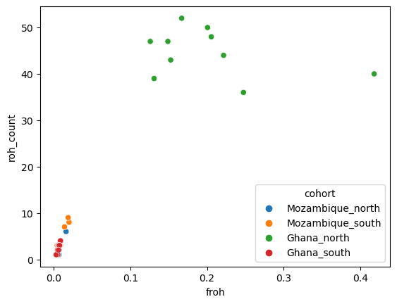
We can see that the population from Northern Ghana is quite atypical with very high numbers and frequencies of runs of homozygosity.
Congratulations on reaching the end of this notebook. You should now be able to start analysing Anopheles funestus data using Af1.0.